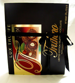
I have a lot of things stashed into categories, stuff I've been trying to go through and get into books. The Truffino journal is a book themed around fancy chocolates, and was a way to use certain elements I've saved forever.
This book was completed on Aug. 14, 2016. It's spine width is about an inch, which means I couldn't add more than two fat signatures which caused it to bulk even at that. To keep it less splayed I added a black satin ribbon around it as a closure (left).
To the right is the back inner cover, a brown swirly scrapbook paper that's been glazed and then accented with craft tape. I simply folded over the box sides to complete it.
The cover itself is made from a Truffino box, the gold foil eye catching to me since I'm big on shiny stuff. Not only can you reflect your thoughts in the book, but the book reflects you, literally. :P
Side views, you can see how the book splays on the left, and how puffy the contents are on the right.
First page and the front inner cover make the introduction warm and inviting. Great part is the inner part of the box came like that, so I only had to cover the back side of the book.
Most of the packaging I find pleasing in this book are the ones for liqueur chocolate cherries.
I liked the color of this Belgium Blonde Ale box, it matched the chocolate boxes I chose for the book, so I settled on using it and even created a tuck spot, complete with tag.
Speaking of tags, all throughout the book I added tags to my tuck spots and pockets, each made from basic flat toned papers that matched the color scheme. And in each of the journals I make, I face the challenge of finding ways to use up every bit of the packaging I incorporate into the book, that includes the end tabs of boxes and such. I find that using the ends of packaging as pull tabs on tags is a fun way to use up the scraps.
The thing I love about chocolate packaging is all the foil paint they add, like on the Godiva package to the left. One of my favorite pages though is the one where I used a Toblerone box and Lindor bag (right). I'm not sure why I like the colors of it, but I do know this is the only spot in the journal where blue was incorporated.
This had to be my favorite pocket spot in the whole book. I loved the bag before, and now I'm happy to have found a place to use it. These chocolate cherries were great, one of the reasons I saved the bag to remember the brand.
I was inspired to add my own hand cut cherries on a string, made from scrapbook paper, marker, and clear emboss. the idea of hanging things from center strings came from Ephemeras Vintage Garden, her trademark to add hearts on the ends of her signature strings.
I made a video flip through of course, just of the basic book with its tags.
I'm not sure yet whether I want to keep this one or sell it. This is an issue I've been having trouble settling on for all my journals, having to figure out which ones to keep and which ones to sell. If I do decide to sell any one of them I'll be sure to add a link in the video description or somewhere....but currently I haven't made a decision.
Bringing up that subject, I may start trying to add more scrapbook paper to my books in the near future, and lean towards making quirky scrapbooks with less junk stuff.


