Monday, December 18, 2017

Mini Christmas Books and Boxes

On Dec. 12 I had found these holiday craft tapes at the Lidl's store. It was my first visit to the store, and I discovered many interesting things in the 'stuff ' section. The main thing that interested me were of course the scrap book items.

I had been wanting some holiday tapes for my Christmas books that I've been working in, so a pack of 8 tapes for two dollars was a great find.

My first craft project using the tapes started on Dec. 13, 2017.

I had a bit of fun tonight with a small project. The craft tape  had these little cardboard ends in them to hold the tape in place. I took those ends and turned them into mini boxes, then decorated them with some of the tapes.

They could serve well for any miniature dessert or gift in the doll world. I love the classy look of the gold trees, and the red Polish country look of those funny reindeer with fur trees.

The gold box came out better than the red because I did the red one first.


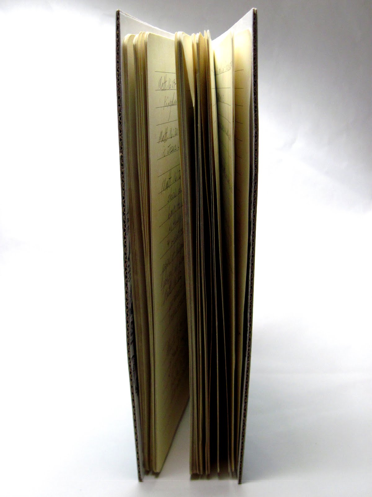
On Dec. 18, 2017, I had some fun with making these mini Christmas books. They only measure 4.5x4.5 cm. and are made from the box tabs of some festive Crelando craft tapes.

I used some folding and gluing techniques to makes the pages for these mini books, each only needing one sheet of basic printer paper and a bit of card stock for each book.

It was super simple making these, the spine was formed by gluing two parts of the box tabs together.

On the insides I wanted a bit of interest, so I used the tapes that came from the box to decorate.
There's the starry gold album, and the red reindeer album.

I added closures of ribbon and gold elastic. When open the little books kind of like to splay out.

Tuesday, December 5, 2017

Blue Bubble Book

Started Dec. 3, 2017- completed Dec. 5, 2017. Measures: 12.5 x 11 cm.

The Blue Bubble Book was one of those randomly started mini books made from square tissue boxes.

I had started it with two window pages that were going to be added as free floating pockets in a different island themed journal (the first island themed book I had started in a teal colored binder to be precise). 
I had several other tissue box tops and sides which I had saved and not used. This seemed like a good opportunity to turn them into something, and the whole bubble theme sort of just came together on its own.

I made a few additional pages from white card stock for the book, decorated with scrap book paper strips and security envelopes, added mats and tags here and there including in the front pockets of the cover itself, and did a bit of detail work with a Tim Holtz stamp and stencil.

I inked up my fins, pages, and tags with light blue and also black ink, used Tim Holtz broken china ink for my stamping on the inside, colored on a stencil with a Le-Plume marker, and even had to use a bit of potato starch on the project.

I made a bit of mistake when making the covers. The tape I had added to the fins of the spine overlapped on the edge of the fin, which was still exposed inside the pocket. That little sticky strip still exposed cause my mats to tack slightly. In order to fix this I sprinkled potato starch in the pockets and dusted it around before shaking out the excess. This prevented the sticky from sticking for the most part.

Wednesday, November 29, 2017

Reed's Ginger Ale Junk Journal

Started: Nov. 27, 2017. Completed: Nov. 29, 2017. Measures: 12.5 x 13 cm.
Reed's ginger ale and ginger candy products have always been eye catching with their bright colors and geometric designs.

This is one of the reasons I've kept multiple boxes of this brand in my stash for using as tuck spots, journal cards, and in this case a book cover.

This is the all recycled edition. I plan on making a second version with one of the boxes using pretty scrapbook papers on the pages.

For this version I used the fin binding, and made my base pages from black card stock. Additional flips, tucks, and pockets were made from recycled items like sardine and oyster boxes, along with security envelopes. Any additional tags and miniature collages were made using scraps leftover, with a bit of stamping here and there.

The front covers have an internal flip out for more writing space, and a closure of double tied teal ribbon.

Tuesday, November 7, 2017

Seaside Apothecary Book

Started Oct. 30, 2017. Completed: Nov 7, 2017. Measures:13.5 x 14 cm.

I enjoyed making this journal just because the colors of it are relaxing to look at. Continuing practice with a fin binding technique, I found a way to use up certain specific elements that were still lying around in my island junk journal supply bag.

This book has to be my favorite as far as the cover is concerned. The internal pages on the other hand weren't planned, they were technically just leftovers from larger island themed journals I had been making. those leftovers somehow complimented each other rather well.

You can see the stages of my work on the cover above. Its spine is around 4.5 cm. wide. To make it I chose some thin board for my base, left a gap between the spine and covers on either side, then held it together using a pretty teal blue colored paper with little white flowers on it, along with a woven basket looking paper.

I chose the teal paper because it reminded me of the ocean with small traces of sea foam. The choice of using a paper that looked woven reminded me of a basket made from ocean grass that you carry seashells in. Both these papers were from a stack found at a yard sale, so I don't know what brand they are.

The decorative square base I adhered my shell pictures to was from a small dollar paper pack by Studio 112. Another element from that pack also made it into the book as a journal spot. The shell images and ocean wave boarders were dye cuts and vellum boarders from the K and Company-Tim Coffey travel collection.

I used my new Tim Holtz distress tool to add some interest to the spine cover and decorative square, then inked the edges with Tim Holtz vintage photo ink. I wanted to give it that rough seashell basket appearance.
I glued down most of my elements including the vellum boarders using fabri-tac, which works surprisingly well on transparent mediums with slick surfaces.

Other parts in making the cover were experimental. When creating my fins for adding pages to, I hid the white cardstock using strips of the same paper I decorated the inside with. This made it blend in, and I inked the creases a bit to further hide the white color.
Everything was sealed and protected using Liquitex varnish, all except the vellum pieces.Vellum resists thin varnish. 

After the cover was finished, I simply added my assembled pages to the fins, and got a cute mini book made mostly from recycled materials.

I used white, glossy cardboard, ink, a Smash book rub on of an anchor, scrapbook paper, parts of a bubble patterned tissue box which has been in my stash for ages, a sand and sea tissue box top with window, paint sample sheets, washi tape, a hand sewn plastic bag with stamping done in Staz-on ink, and finally half a ginger ale box with a whale on it.

About the book's name: Two of the paint sample cards I added in the front of the book as inserts have little labels on them that inspired the name. One says dried mint, another is labeled Apothecary Jar. Among these are blue cards with names like Fountain Foam and Niagara Blue. This inspired me to name the book Seaside (or Sea Foam) Apothecary.


There was another reason I liked this name, and the name itself inspired me to add a couple of experimental mason jar shaker cards (shown left). Seaside Apothecary as a theme is based off of a setting from one of my stories (the MN- I role play). In the beach region with a sea town, there's an Apothecary owned by a character named Dorian. He's friends with the local medic and renowned chowder house owner, Irna, who visits his apothecary for herbs and spices relating to both her healing job and her restaurant.
The mason jar shakers were something I added specifically to represent these two characters. One jar has herbs in it, the other has chowder.

I viewed the jars as exchanged gifts between the two characters. Unfortunately my chowder (which isn't actually a shaker) ended up looking kind of like barf in a jar. I'm sure it tastes great....just looks odd. This was a result of making a collage with green pasta and shrimp, then painting on it with a cream colored acrylic, an attempt to make it look like chowder. 

The herb collage in a jar is a partial shaker in the sense I used a small hole punch to create free floating peppercorns which can kind of move around. The jars were stamped on plastic, then glued to white card stock using fabri-tac glue.

Sunday, October 29, 2017

Key Lime Pie Book

Started: Oct. 24, 2017. Completed: Oct. 29, 2017. Measures: 8 x 8 in.

The Key Lime Pie journal. This is the first book I've ever made using the fin binding technique.
I guess browsing through so many Youtube journal videos has helped me explore new possibilities.

I've included two pictures of what my first fin binding looked like (far left in the panel above). It was simple enough to attach against the spine with my new 1'' wide double sided tape.

I've had this key lime pie box in my stash for years. I've always liked the colors and artistic set up of it, so much so that I didn't want to do anything with it if it meant covering up or cutting down some of the box's design.
The best way around that was to use it as a book cover instead of a journal insert as originally planned. 

I picked out some papers that fit the mood and colors of the book, including its chosen contents. The colors and style all seemed to lean towards a tropical theme, so I aimed to add beach based and tropical items to my pages.

My pages were constructed from white card stock, then inked with blue around the edges. I assembled my pages and all the flips first before adding them to the fins.

Recycled items I chose to use include aquatic themed candy and dried coconut bags, tropical colored Popsicle boxes, a lemon bag,and part of a Jone's soda box. Added accessories were made using things like storage jar paper decorated with taffy images, paint sample cards, and other recycled items. 

Decorating the pages and inner cover was a fun experience for me. I don't normally use a lot of scrapbook papers combined with my junk journals, but for this one I did, and I love the results.
Like the usual, I sealed my inner cover with varnish, and then for the rest I inked the edges of my cards and papers black before matting them together.

Monday, September 4, 2017

The Asian theme- on the craft desk

Aug. 19, 2017

At the craft desk again, I've been doing on/off work through the weeks relating to Asian themed journals and accessories. I've done Asian books before, but I still had a whole bag of stuff relating to it, and have needed to get it out of the way.

After a bit of spontaneous brain storming and less thought just hand work, I clumped together a book themed around all my favorite instant noodles that I like from the Asian store.
It doesn't take much to fill a book that can only be 1'' thick, so I still had plenty of leftover things like an entire bag of noodle packaging I've been saving for collage, art bags, and whatever else that may come to mind for journal accessories to use personally or to sell.

Some extra things were worked out on the cover, but I found a cereal box as a base, and a rice bag for decoration worked well for a noodle book. I also discovered that rice bags are not only heavy duty, but rather sticky resistant. The double stick tape I used to hold it down didn't quite take on the edges, and I had to manually poke holes in them before sewing some looped stitching in black around them.
The sewing actually gave the edges an interesting touch, and did the job of holding them down.

Aside from the noodle book, I also added some other items from the Asian bag into already existing Asian books of mine. That helped pare down some of the build up in the bag and make for some interesting writing subjects in the books.
Sometimes I see funny things when sitting among my piles of junk, like an eye of a woman's face peeking at me from behind the layers of fliers (left). It's one of those moments of 'suddenly I feel watched'.

Despite the fact I reach into the piles and feel like I progress, standing back and seeing what I still have makes me feel like I haven't progressed enough. One bag gets organized and emptied during a project, but the leftovers end up in another bag, like all those Asian noodle packets in a corner (right).

Thursday, July 27, 2017

Marketside Baseball Book

Marketside Baseball Book- Measures: 7 1/4 x 12''. Started: Nov. 15, 2017. Completed: Jul. 27, 2017.

This journal was an interesting one to make. I spent several days working on it and only just finished it a day ago before photographing the results.

I had to make adjustments along the way, and cover up a few mistakes. The internal cover which I sewed my three signatures to was cut a bit short, so I had to disguise the edges with some washi tape. The mustache washi seemed fitting enough for a baseball book.

The full cover is made from a Marketside pizza box which had come with some baseball cards inside. To fill in the space which was once a window to show the product, I created my own baseball paper texture using a circle stencil, felt pens, and red gel pen.

Both signatures are plain white sketch paper cut to size from a very large paper pad. The thickness of the paper is a nice quality, and blank books are of course friendly for decorating however one pleases.

I started the project back on Nov. 15, 2016, mentioned about the beginning of it here. I didn't actually get to working on it till nearly a year later.
It all started from a pizza box.

Thursday, July 13, 2017

Whole Foods Mini Bag Books

Had some fun with making a mini book for your purse to write down grocery lists, keep coupons and receipts in the front and back pockets of the cover, keep labels of foods you like the most and where you found them, or the book can be used like any journal for whatever.

I made this book from a mini Whole Foods paper bag (the kind they put glass bottles in). When folded it became the cover of my book, and then I cut down a larger bag from Whole Foods for the pages.
I sewed in my single signature with green twine, and then made a cardboard button closure by stamping on some white scrap packaging, fussy cutting it, and then poking a hole. I sewed it on and made a shank with my thread, leaving excess twine to wrap around the book and button.
Extra mini booklets and items came out of the project, three mini books (left), and a type of prototype paper wallet (right).
One of the mini booklets has a harder cover because it was paper from the bottom of the bag. Scraps from cutting down the large bag were left, so I put together the ones that were the same width and then sewed them together with the same green twine.

These minis could be used for the same purpose of keeping notes and grocery lists while on the go.

Monday, July 10, 2017

222 Plate Box notebook

Awhile back I had saved these pretty boxes which once held peacock and paisley decorated plates. They were pretty, and I thought of multiple ideas on how to use them.

Several days ago I put these boxes to use, and made two of them into a book cover. Mom had a notebook that was falling apart and I kept the pages together with a clip till I was ready to work on it. The original cover was tearing away from the end papers, and it was once sewn with a coptic stitch style. I decided to replicate this, but with a new cover and a few added papers to pull things together.

I followed the instructions by Sea Lemon on Youtube to get the coptic stitch right, and in the end was pleased with the binding.

It looks interesting from the side, allows the book to lay completely flat when open, and doesn't require me to make a spine.


The stitching that holds the cover to the pages is exposed from the front and back. It kind of looks like a Japanese binding in some ways, but more flexible.
For the inner covers I used white card stock and stamped it with some of my favorite paisley styled stamps, to match the design of the box. I coated these stamped papers with Liquitex satin varnish.
I had to add some papers to loose front and back pages so I could fold them in half and add them to a signature. This only needed to be done in two spots of the book, on the front signature and the back signature.
I used some tan calligraphy paper for this, to go with the cream shade of the note pages which had slightly tan grunge patterns printed on them.

The front signature's added page came out a bit shorter than it was suppose to, but I left it. Thankfully the back signature came out properly.
Most of the signatures had been sewn together, so I yanked out the old thread that had broken in places, then used new cording to bind it through the already existing holes.

One odd thing about my experiment with the coptic stitch is that it left a slight gap between some signatures, which doesn't bug me, it's just a note to remember stitching might not tighten as much as it could.


Tuesday, March 21, 2017

Eat Fish Book


 (Mar. 21, 2017)
 
"Eat Fish", a book which was completed some time before the 21'st (the day I took the pictures). This book was made as a gift for someone who wanted to know how to shop for different kinds of fish.

I used a saved sardines box from a brand I came to really like the flavor of. They're a product of Spain, found at an Asian food store.

It turned out pretty well, as it ought to have considering I spent over a month practically slaving on it as I went through the process of assembling the pages, then chronicling them into signature sections which matched up with the index numbers. 
even more of a pain was thinking forward, back, and flip side for proper printing of double sided pages.
 
After all that work, I saved the print pages for future use, hopefully for when I'm ready to make a fish book of my own.


The spine of the cover is silly in the sense you can read the ingredients of the once existing sardines.
I covered the insides of the book with origami paper that matched the red of the cover, while reminding of fish scaled and ocean waves.
It had to be glued to white card stock, then sealed with liquitex varnish for stability.
I had four signatures in total, which scrunched up into a relatively small width. At first I thought I wouldn't have enough room along the spine to fit them comfortably.

One of my favorite pages in the book is where you find the mahi mahi fish. Its colors are all my favorites.
 
I did have to look up the names of the fishes on Google images as I worked, which took some time, but made the book that much better. This tiny booklet is a condensed collection of all the fish descriptions listed on the Chef's Resources website, including screen shots of the flavor scales.

Only thing I had someone else do since they wanted it, was to list oily or white fish next to the names of the fishes in the index.

I found it convenient to take pictures of the book on my recent water color background project which I just started the night before.
 
Enjoy a small video flip through.